

Mushon Zer-Aviv dissects the beautiful lies inherent to many infographics, showing how these visuals can be as manipulative as a devious argument.
Via luiy
Get Started for FREE
Sign up with Facebook Sign up with X
I don't have a Facebook or a X account


 Your new post is loading...
 Your new post is loading...
Your new post is loading...
Mushon Zer-Aviv dissects the beautiful lies inherent to many infographics, showing how these visuals can be as manipulative as a devious argument. Via luiy 
|


When working with raw data we’re often encouraged to present it differently, to give it a form, to map it or visualize it. But all maps lie. In fact, maps have to lie, otherwise they wouldn't be useful. Some are transparent and obvious lies, such as a tree icon on a map often represents more than one tree. Others are white lies - rounding numbers and prioritising details to create a more legible representation. And then there’s the third type of lie, those lies that convey a bias, be it deliberately or subconsciously. A bias that misrepresents the data and skews it towards a certain reading.
It all sounds very sinister, and indeed sometimes it is. It’s hard to see through a lie unless you stare it right in the face, and what better way to do that than to get our minds dirty and look at some examples of creative and mischievous visual manipulation.
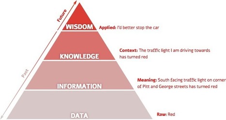
Over the past year I’ve had a few opportunities to run Disinformation Visualization workshops, encouraging activists, designers, statisticians, analysts, researchers, technologists and artists to visualize lies. During these sessions I have used the DIKW pyramid (Data > Information > Knowledge > Wisdom), a framework for thinking about how data gains context and meaning and becomes information....